


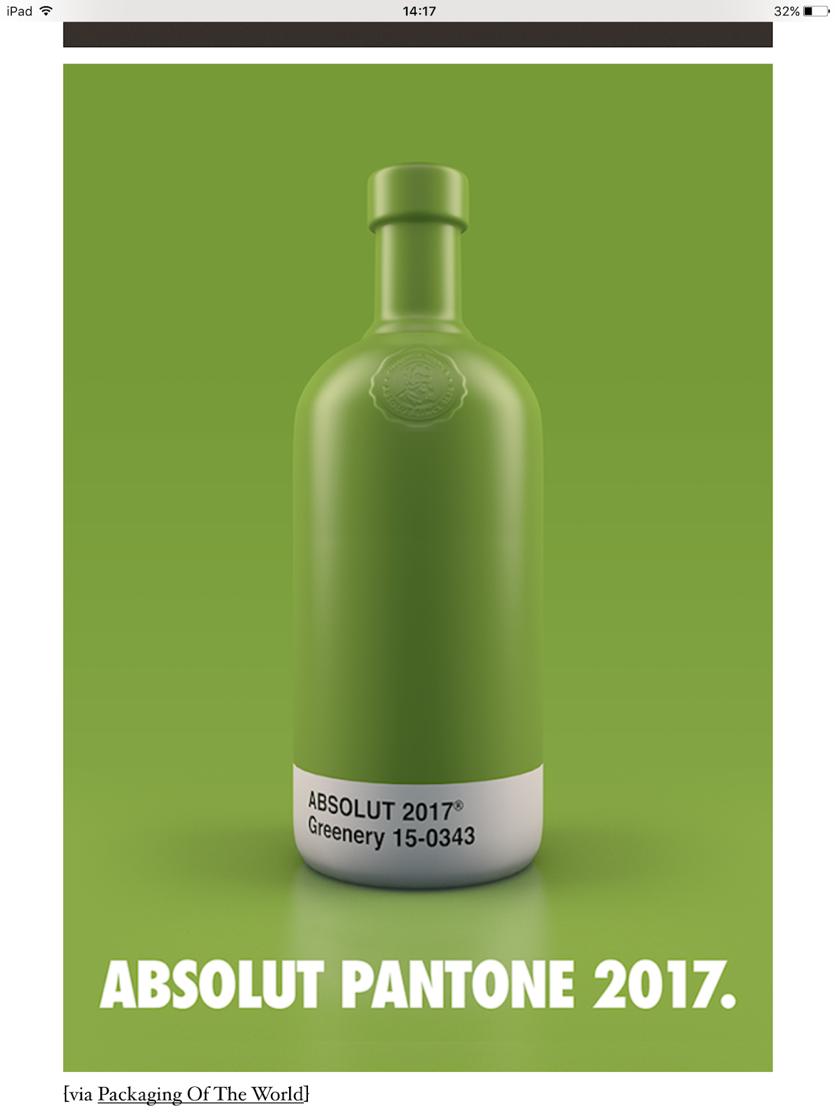
The above article is a Absolute Vodka rebrand by a studio called Txaber based in Spain, the rebrand consisted of a Pantone block colour on the bottle packaging to reflect the flavour of the Vodka. I found these designs to be a excellent branding take upon a minimalist style. The use of colour is very bold and eye catching and if seen in a store all beside each other you would clearly be able to identify each flavour of the vodka meeting the purpose of the redesign, which is a really good design strategy for been eye catching and drawing attention to the bottle. I would like to be able to do a project that allows me to experiment with bold colours and branding in this style. This is also great inspiration for the use of colour for my YCN brief for the orchard pig.
No comments:
Post a Comment