Monday, 29 February 2016

branding of dom

When discussing with Dom ideas of how he would like to branded and portrayed in the branding he
stated that he would like it to perprsent his photographyc style of preferred working.
A classic, minimal approach in which contains limited shapes, text and a limited colour pallet. As Dom likes to take picture using his polaroid camera i feel like this may be a good thing to experiment with or possible a good idea to apply the branding to.


After considering all these ideas i decided to start sketching a few ideas 

Elaborate writing to create a professional looks (spelt name wrong, should be d cartilege)

two different quick sketches based on the idea of the camera shutter as triangles 

Design based on the d and c of dom initials in the style of a camera shutter, and surrounded by a line that represents the shape of a camera. This is an appropriate response as it is relevant to the aspects the i identified when talking with dom, but the design could be simplified to have the appearance of a more sophisticated photographer. 
This design consists of two polaroids with doms initials inside each of them. This design is an appropriate response as it consists of his initials and also is a appropriate representation of his preferred style of photographing. 


This design is simplified design of my first one. This is my most appropriate and successful response out for them as it is simplistic, sophisticated, and also represents dom with his initials as well as his style of work, with the lettering being formed from the shape of a camera shutter, this it why this is my chosen design for my branding of Dom Cartlege. 

below is an example of how the logo could be applied to a product such as a polaroid 


Doms branding research

From discussing doms branding i decided that i would look into other photography branding projects to get an idea of what kind of products the branding was applied to and how it is used to help influence my designing of the actual logo.

flyers

contracts, business cards, envelopes, over image samples

business cards

posters, flyers, contracts, business cards, envelopes, over image samples, note books/photo albums


business cards


logo inspiration -


Sunday, 28 February 2016

Thinking about printing products

When thinking about how i will print my business cards, flyer and also printing onto my sketch book covers i had 3 different processes to choose from which all had there positives and negatives.

mono printing
+ traditional method
+ once design created easy to produce a lot
+ create textured prints that would create a personal touch
- prints may all be different and not perfect

digital printing
+ quick to print
+ design comes out same as seen on the screen
- costs a lot to have printed to high quality and on good stock (cost per page)
- limited on colours no metallic colour can be printed

screen printing
+ traditional method of printing
+ once screen prepared can have large print run for not extra cost
+ only ink costs money, and nice stock if wanted
+ creates a textured print that would create a personal touch
- long preparation time for screens

From the methods considered above i have chosen to print using screen printing method as i have pervious experience in this method, the prints will also not be limited on colour choice and have a personal touch of being printed by hand. Although mono printing has the same effect, screen printing has a more reliable out come as all print will print the exact same.

Saturday, 27 February 2016

Creating art with meaning

It is important to me that i am able to create a piece effort work that has meaning, as is different to my current style of work or geometric drawings. Recently a friend of mine cam to me asking if i could draw hima design in memory of his recently pass away grandfather that meant a lot to him, at first i was a lot overwhelmed with the challenged as it was big ask to create something so personal to him, but as well he was going to have this design tattooed on him.

When discussing with him what to do as the design we identified that he liked the idea of a swallow bird as it reminded his of his grandfather as he had many figurines of them, and he also liked the idea of a compass as a swallow travels similar to him and his grandad. After identifying these things i started to draw a few ideas.

First bird drawn - decided didn't like poisoning of birds wings


Above is the final design that i created in response to the personal brief, i decided to combine the two things. The geometric design of the compass behind the bird shows my persona style in the design.

Above is the final tattooed design, the tattooist and my friend decided to shade the design to add depth and make the drawing work better as a tattoo design, when speaking to my friend about it after he said the tattooist was very impressed with the drawing as there was minimal changes that he need to do to it before tattooing.


Friday, 26 February 2016

letter press

Recently i took part in a letter press workshop which showed us how to put together a basic template design and explain how to use the printing press. 
When creating a template you have to consider :
- what you are wanting the text to say
- how many words you want per line
- how you want it to line up 
As well as these few point you need to keep in mind that it needs to be back to front the letter from or the design will not print properly. 
After this workshop i went back in my own time to create my own design. Below are images of my attempt at letter press, at first my design was slightly wrong as i had a few letter the wrong way round as it is tricky at firs tot get your head round which way the need to be.  After a trial and error i perfected the design a created a range of prints.


Also when printing i decided that i would lessors onto on of my mono prints to see how the two traditional print methods work together. From this method i discovered that they work well along side each other and that they compliment each other nicely.

Research into advanced letterpress designs - 


Thursday, 25 February 2016

mono print

I recently attended a workshop at  the college campus of lca to try mono printing, this is something i have been looking to try for a while so i was excited to learn more and develop my existing skills and knowledge. Mono printing is a great technique to use to create detailed drawings that screen printing  does not allow, there are many different ways in which you can create mono print images such as using cut out shapes similar to what i did in my workshop but you can also carve into a piece of plastic to use like a stamp what you roll the ink onto or you can get the design laser cut so it is more precise allowing you to create the design digitally and print in a more promotional way.
below are a select few of the prints i created during my workshop - 


After taking part in this workshop it has inspired me to use this method of printing to create interesting patterns and also add depth and texture to what would be a flat digital design.

here are a few mono prints that i found interesting when doing research into mono prints that artist had created -


Monday, 22 February 2016

photographing products

studio lighting types
White background - creates minimal to no shadows at all creating a flawless finish

Black background - creates shadows and depth to the product


my work 
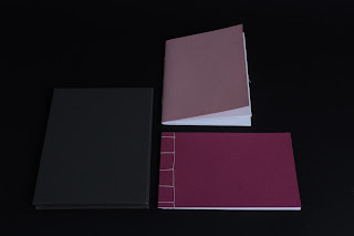
The black background worked well for my concertina book as it created shadows which 
emphasised the length and folds of the book. 

The black background also worked well on my pamphlet stick book as the front cover, pages and stitches are a pale colour and contract nicely with the dark background and the detail is clear, unlike with a white background where the pale detail would be lost with out the contrast and shadows.

 the black background works well on creating depth for products but in this compassion of 
items the dark concertina book appraise the fade into the back ground in the top image, but by slightly lowering the camera, in the bottom image the white of the pages is slightly visible and
 brings the product back again.

The white background works well on creating a flawless image of a range of different objects with a range of different material. 

White background - great for photographing products for selling, creates no shadows and makes products look flawless 
Black background - good t creating depth with shadows and also contrasting with light objects, also good at giving products personality and not look flat.


 examples of good product photography that i would like to try with my self branding project -