Before designing the layout of my presentation i thought it would be helpful to research creative presentation so that i had idea of the design of lies that were interesting so that i didn't loose the attention of my audience. Below are two examples of presentation slides that i thought were interestingly laid out and designed.


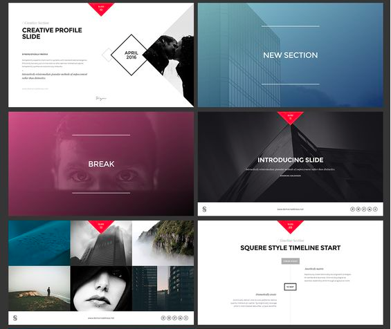


The two presentation have two completely different styles, the first used a lot of imagery and constantly kept the red triangle on the slides creating a link and constant theme throughout the presentation, the images were large so very visible and also put in creative compassion. The slides were never full of text and when text was involved it was a good legible size which is important it there is text on a slide giving important information.
The second presentation had a nice bright white background thought the presentation with a fades image of the world in grey. the prevention did have large amounts of text at times but t was at a readable size. The presentation included a lot of charts but there were done in and interesting why in which didn't overwhelm the viewer.
Out of the two presentation it think that first was the most successful as its imagery was engaging as well as its small amounts of text, allowing the presenter to talk and explain what the viewer was seeing. This is the style of presentation that i want to try produce.
Another presentation i looked at was sagmeisters presentation about being happy and creating design.
In the presentation he shares experiences that he has had and also his inspiration. Through out the presentation sagmesiter uses humour to engage the viewer and relate to them. This works well as they feel like they an relate to him by listening to his experiences and laughing with him at them.
No comments:
Post a Comment